AWH Basic: Potential of Mean Force and Convergence Assessment
authors            : Claudia Alleva, Cathrine Bergh
goal               : Learn the basics of AWH, how to set up a simulation and analyse the results
time               : 60 minutes
software           : GROMACS 2024.2, Python libraries: numpy, matplotlib, NGL Viewer
optional software  : VMD (visualisation), Xmgrace (plotting)
tutorial source    : https://zenodo.org/uploads/16793062
version            : 0.2
Target audience
This tutorial is aimed at experienced GROMACS users, familiar with the basics of MD simulations and how to set them up using GROMACS.
Prerequisites
GROMACS 2024 or later (other versions will likely work, but there might be minor differences)
Having followed the introduction to MD tutorial or having some experience setting up standard MD simulations.
Optional
a molecular viewer, e.g. VMD
a plotting tool, e.g. Xmgrace
Before we start, we will import some of the Python libraries that will be needed throughout this tutorial.
import matplotlib.pyplot as plt
import numpy as np
import nglview as nv
Introduction to AWH
A common challenge when running MD simulations lies in the discrepancy between the time resolution we need to capture fast motions on the atomic scale and the timescales of the biological or chemical processes we are interested in. This sampling problem is the primary reason our MD simulations often become very computationally heavy as we often need to wait for a long time until something interesting happens. An alternative is to try to force, or bias, the system to climb the energy barrier separating the states we want to sample, instead of waiting for the crossing to happen stochastically. Over the years, a whole swath of methods applying different approaches, have been developed to introduce such a bias to speed up state transitions. These are called enhanced sampling methods. In this tutorial, we will introduce the Accelerated Weight Histogram method (or AWH), which is implemented in GROMACS.
AWH enhances sampling by applying an adaptively tuned bias potential along a chosen reaction coordinate describing the state transition of interest, so that it “flattens” the barriers separating the states. This allows the simulations to sample the state transition more frequently than without using any bias.
For more details about the AWH method and how it can be applied we refer to: * The GROMACS reference manual section about AWH, available on the GROMACS documentation website * BioExcel Webinar: Accelerating sampling in GROMACS with the AWH method * The original AWH tutorial * The free energy of solvation with AWH tutorial * Lindahl, V., Lidmar, J. and Hess, B., 2014. Accelerated weight histogram method for exploring free energy landscapes. The Journal of chemical physics, 141(4), p.044110. doi:10.1063/1.4890371 * Lindahl, V., Gourdon, P., Andersson, M. and Hess, B., 2018. Permeability and ammonia selectivity in aquaporin TIP2;1: linking structure to function. Scientific reports, 8(1), p.2995. doi:10.1038/s41598-018-21357-2 * Lindahl, V., Villa, A. and Hess, B., 2017. Sequence dependency of canonical base pair opening in the DNA double helix. PLoS computational biology, 13(4), p.e1005463. doi:10.1371/journal.pcbi.1005463
Our exercise: estimating the binding energy of two pyrimidine molecules
In this tutorial, we will sample the aggregation of two identical pyrimidine molecules and estimate the free energy of their interaction. This simple system allows us to explore AWH using limited computational resources, but still captures much of the essential complexity that characterises real, scientific, problems. Similarly to the umbrella sampling GROMACS tutorial, we will use the pulling code to bring the two pyrimidine molecules together in an aqueous solution and then compare our estimate of the free energy of binding with the results from the umbrella sampling tutorial.

Pyrimidine diagram
Figure 1: A single molecule of pyrimidine
The first thing we need to do is define how to bring these molecules together (i.e. selecting the reaction coordinate) and this is one of the crucial choices that needs to be made when using most enhanced sampling techniques. Here, we will choose the vector that connects the center of mass of the two molecules. Our reaction coordinate is shown in red in the figure below:
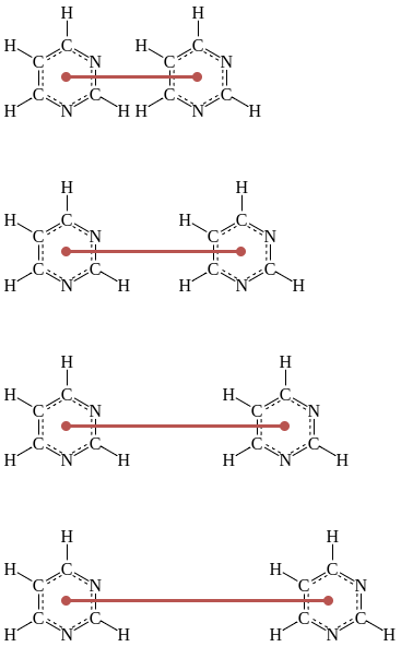
Sampling locations
Figure 2: An illustration of how the pyrimidine molecules will be separated/brought together with the reaction coordinate shown in red
The goal is to get an estimation of the free energy landscape along our chosen reaction coordinate. To do so, we will need to bring the two molecules close enough to capture a free energy minimum expected to represent stable binding, and separate them far enough to ensure that we capture a baseline where the molecules do not affect each other energetically.
System preparation
Input files for this tutorial have already been prepared in advance following a similar scheme as described in the introduction to MD tutorial. If you have not followed that tutorial yet… what are you doing here? It was a prerequisite! Jokes aside, you can follow this tutorial but we will skip most explanations regarding system preparation. If you want more information on these parts, see the aforementioned introduction to MD tutorial and the umbrella sampling tutorial.
Let’s first change our working directory to the data folder, where we will keep all the generated data in this tutorial.
# Get the full path from which the tutorial was launched
tutorial_path = %pwd
# Change to the data folder
%cd $tutorial_path/data
You can find all the prepared input files in the provided input
folder.
%ls input
Now, let’s prepare our simulations with the provided files.
Setting the GROMACS parameters for pulling
As for any GROMACS simulation, we need to set the parameters in the
.mdp file appropriate for the type of simulation we want to run.
When using AWH in GROMACS, we need to pay special attention to
parameters with names including pull or awh. These parameters
will let the simulation engine know that pulling and AWH will take
place, and describe the reaction coordinate(s) and bias(es).
GROMACS typically uses pull groups and pull geometries to define pull coordinates (i.e. reaction coordinates). As shown in Figure 2, we will use one pull group for each pyrimidine molecule. The distances betwen the centers of mass of those groups will define the single pull coordinate.
Setting parameters for the pull code
Here, we will go through the settings needed to set up the pulling part of our simulations.
First of all, let’s turn on the pull functionality:
pull = yes ; Use the pull code.
We then need to specify how many atom groups are needed to define the pull coordinate (two in our case), how many pull coordinates to use (one), and how frequently we want to write the coordinate value in the pullx.xvg (every 5000th step).
pull-ngroups             = 2                   ; Number of pull coordinates.
pull-ncoords             = 1                   ; Number of pull coordinates.
pull-nstxout             = 5000                ; Step interval to output the coordinate values to the pullx.xvg.
As with other kinds of groups in GROMACS (e.g. temperature-coupling
groups), the pull groups are described by index groups in the index
file also supplied to gmx grompp (typically named index.ndx).
pull-group1-name         = pyrimidine_1        ; Name of pull group 1 corresponding to an entry in an index file.
pull-group2-name         = pyrimidine_2        ; Same, but for group 2.
To use AWH, we set the pull-coord-type to external-potential and
the potential provider to AWH with pull-coord1-potential-provider.
pull-coord1-groups       = 1 2                 ; Which groups define coordinate 1? Here, groups 1 and 2.
pull-coord1-type         = external-potential  ; Apply the bias using an external module.
pull-coord1-potential-provider = AWH           ; The external module is called AWH!
Setting parameters for AWH
Now, we will set all the AWH-related parameters.
First, we need to activate awh , decide how many biases are applied
(1 in our case) and decide the frequency at which the bias, coordinate
distribution, PMF and friction should be written (every 50000th step).
awh                      = yes                       ; Activating the AWH code with 'yes'
awh-nbias                = 1                         ; Defining how many biases are applied
awh-nstout               = 50000                     ; Frequency at which the ener.edr file will be updated by AWH
NOTE: The value of awh-nstout will only govern how frequently you write your files, NOT how frequently the bias is updated!
Now, let’s define the bias-specific options:
First, we define which ‘shape’ the target distribution should have
(constant in this case), and we also choose the histogram to be
equilibrated before a covering is considered achieved
(awh1-equilibrate-histogram = yes).
awh1-target                = constant                ; Defining the type of Target Distribution
awh1-equilibrate-histogram = yes                     ; The histograms need to be equilibrated before a covering is achieved
We choose a flat target distribution (option constant), since it’s a
good first approximation and reflects our objective to flatten the
energy barriers and sample the entire space.
Then, we need to define the dimensionality of the reaction coordinate, which is one in our case. We also set an index for our reaction coordinate.
awh1-ndim                  = 1                       ; Defining how many dimensions are used to define the bias
awh1-dim1-coord-index      = 1                       ; The index of the dimensions used
Finally, we need to set our sampling interval of interest (between
awh1-dim1-start and awh1-dim1-end in nm), the force constant of
the harmonic potential (kJ/(mol*nm^2)), and an estimated value for the
diffusion constant (nm^2/ps).
awh1-dim1-start          = 0.35                      ; Start of the sampling interval (nm)
awh1-dim1-end            = 2.35                      ; End of the sampling interval (nm)
awh1-dim1-force-constant = 40000                     ; Coupling force constant
awh1-dim1-diffusion      = 5e-5                      ; Diffusion constant along the defined dimension
The sampling interval is defined in terms of the reaction coordinate we
chose, so now we want to set awh1-dim1-start so that the molecules
are as close as possible but not overlapping (keep in mind the distances
are defined from the center of mass of each of the molecules).
Similarly, we want to set awh1-dim1-end to represent a distance
where the two molecules are not affecting each other energetically, and
~2 nm will fulfill this requirement as it is longer than twice the
cutoff distance for non-bonded interactions.
The force constant was selected to be high enough to achieve the coupling between the reference coordinate and our reaction coordinate. Meanwhile, the diffusion constant should be chosen as big as possible to achieve fast crossings, BUT the system needs to be stable too, so it has to be balanced appropriately. To set the diffusion constant appropriately, it’s good to first estimate it from a test run, so we recommend to try different values and pick the most meaningful one for your system.
These values, together with the estimated initial PMF error
awh1-error-init, espressed in kJ/mol, will determine the initial
number of bins that ‘have’ to be filled. We will leave the initial error
to the default value 10 kJ/mol here.
awh1-error-init = 10 ; A rough estimate of the initial error
These and many other MDP options for AWH are further described in the GROMACS documentation.
Now, we can look at how the full parameter file, AWH.mdp, looks:
%less input/AWH.mdp
In AWH.mdp, we can see specifications for a standard production
simulation of 100 ns with the added above-mentioned pull-code and awh
options.
With all the parameters set, we now need a starting configuration of our
system to start our simulations from. We can look at conf.gro in the
input folder. This file has been prepared using a similar approach to
what is described in the introduction to MD
tutorial
# Get the current path
path = %pwd

# Read in the structure file
view = nv.show_structure_file(path + '/input/conf.gro')

# Show ions
view.add_representation(repr_type='ball+stick', selection='NA')
view.add_representation(repr_type='ball+stick', selection='CL')
# Show water
view.add_representation(repr_type='licorice', selection='SOL', opacity=0.9)
view.center()
view
We can see that our starting state is an equilibrated system where the two pyrimidine molecules are separated, and that the box is filled with water. We also have sodium (purple spheres) and chloride (green spheres) atoms that give the system a neutral charge.
Running gmx grompp
If you have GROMACS installed, then the next step is to run
gmx grompp. Running gmx grompp will produce the AWH.tpr file
needed to run the simulation but also for running the AWH analysis
tools. As a brief refresher, the simulation will start from the
structure specified by the -c flag, in our case conf.gro, the
topology will be specified through the -p flag and the index in the
-n flag. The index file is needed to define the pulling groups named
in the .mdp file, but also the coupling groups used for
equilibrating the system.
!gmx grompp -f input/AWH.mdp -c input/conf.gro -p input/topol.top -o AWH.tpr -n input/index.ndx
Running gmx mdrun
Now, we are finally ready to run some AWH simulations!
This is a small system, and if you have a GPU, running gmx mdrun
will take a few hours. If you want to run your own simulation, proceed
with the first section below.
If you don’t have time to run the simulations now, you can move on with the analysis using pre-calculated data provided in the reference folder. If you prefer to use pre-calculated data, proceed to the second section below.
Option 1: run your own simulations
If you want to get your own results and compare them with the pre-calculated ones, uncomment the cells below:
First, we will make sure to keep our data organized and create a separate folder called “AWH” in the data folder.
# Create the data folder
#%mkdir $tutorial_path/data/AWH

# Change working directory
#%cd $tutorial_path/data/AWH

#print("Changed working directory to: ")
#%pwd
Now, we can run the AWH simulations! Beware that this might take a couple of hours. Once the simulation is done, you can proceed to the section “Analysing AWH simulations”.
#!gmx mdrun -deffnm AWH
Option 2: use reference data
To proceed with analysis of the pre-calculated data, copy one of folders
AWH1, AWH2, or AWH3 from the reference data folder. Each of
these folders corresponds to one AWH simulation replica generated with
the same protocol as presented in this tutorial. Since the simulations
are stochastic, you might get slightly different results depending on
which replica you choose.
Let’s create a copy of the reference data and move into that folder to keep our results organized.
# Select which dataset to use (AWH1, AWH2, or AWH3)
AWH_dataset = "AWH1"

# Copy the AWH folder from the reference to data folders
%cp -r $tutorial_path/data/reference/$AWH_dataset $tutorial_path/data

# Make this new copy working directory
%cd $tutorial_path/data/$AWH_dataset

print("Changed working directory to: ")
%pwd
!gmx grompp -f ../input/AWH.mdp -c ../input/conf.gro -p ../input/topol.top -o AWH.tpr -n ../input/index.ndx
Now that we have prepared the reference files, we can continue with the analysis.
Analysing AWH simulations
First of all, let’s look at all the files that where produced by our AWH simulation:
#Check what is contained in the AWH data folder
!ls -ltr
AWH.tpr and mdout.mdp are produced by gmx grompp - they are
the input file for the simulation run and a recap of all the parameters
chosen for gmx grompp, respectively.
AWH.gro, AWH.edr and AWH_pullx.xvg are produced by running
gmx mdrun. AWH.gro is the final frame of the simulation,
AWH.edr is the energy file witten during the simulation (and contain
the bias and PMF), and AWH_pullx.xvg contains the value of the
reaction coordinate per time step.
Now, let’s have a look at what happens if we search for all the
instances of awh1 in the AWH.log file. Note that awh1 is
part of the name of the mdp options specified in AWH.mdp as we saw
earlier, and should not be confused with the simulation replica in the
reference data folder which was named AWH1.
!grep awh1 AWH.log
The first few lines give us a recap of the parameters that were used for AWH - some of which we selected and others were set to default values. For an in-depth discussion of these additional options and their theoretical background, have a look at the AWH section of the GROMACS manual.
The first interesting line for us in this tutorial is
awh1: covered but histogram not equilibrated at t = ..., which
indicates that the whole space that was selected for sampling (specified
by awh1-dim1-start and awh1-dim1-end, in our case 0.35 to 2.35
nm) was indeed covered.
The next lines to pay attention to are
awh1: equilibrated histogram at t = ... ps. and
awh1: covering at t = ... Decreased the update size., which
indicates the first time the histogram was equilibrated and the update
size was scaled down since a covering took place, respectively.
The term “covering” might need some explanation. In the AWH manual, it says: ‘a dimension is covered if all points in the […] sampling […] interval have been “visited”’. This means that all lambda points constituing our histogram along the reaction coordinate have to be visited at least once before it is considered a covering. Here, you can find more details on the the covering criterion.
After 2 or more coverings, the following line is printed in the log
file: awh1: out of the initial stage at t = ... ps.. This tells us
we left the exploratory phase of AWH and we are entering the
‘equilibrium-like’ phase of the method. For more details, you can read
the exit from the initial stage
section
of the AWH manual.
Assessing sampling and calculating the PMF
Great, we now know (hopefully) that our system has run long enough to
leave the initial stage, what does that mean in terms of the distance
value that we observe? Let’s have a look at the AWH_pullx.xvg file
to answer this question!
# Load the XVG file
pullx = np.loadtxt('AWH_pullx.xvg', comments=['@','#'])

# Plot the data
plt.plot(pullx[:,0], pullx[:,1])

# Plot lines for the edges of our sampling interval
plt.plot(pullx[:,0], [2.35] * pullx[:,0].shape[0], color='gray')
plt.plot(pullx[:,0], [0.35] * pullx[:,0].shape[0], color='gray')

plt.xlabel('Time (ps)')
plt.ylabel('Pyrimidines distance (nm)')
Here, we can see our whole trajectory (blue) and how the system moves back and forth across our sampling interval. The edges of the sampling interval have been marked with grey colors.
Now, let’s take a closer look at the start of the simulation.
# Find all the lines in log file which contains both 'awh1' and 'covered'
istances = !grep awh1 AWH.log | grep covered

print("The following line(s) containing the word 'covered' was found for awh1 in the log file:")
print(istances)

# Search for the number after "t = ..." in the line(s) we identified previously
list_covered = []
for i in istances:
    words = i.split(" ")
    for j in range(0, len(words)):
        if words[j - 2] == "t" and words[j - 1] == "=":
            list_covered.append(float(words[j]))

# Round to the closest frame (in ps)
t_first_cov = np.around(list_covered[0]/10) * 10

# And find its index
ind_first_cov = np.where(pullx[:, 0] == t_first_cov)[0][0]

# Plot the pullx data
plt.plot(pullx[:ind_first_cov + 1, 0], pullx[:ind_first_cov + 1, 1])

# Plot lines for the edges of our sampling interval
plt.plot(pullx[:ind_first_cov + 1, 0], [2.35] * pullx[:ind_first_cov + 1, 0].shape[0], color='gray')
plt.plot(pullx[:ind_first_cov + 1, 0], [0.35] * pullx[:ind_first_cov + 1, 0].shape[0], color='gray')

# Add a dashed line at the first covering
plt.plot([t_first_cov] * 2, [0.35, 2.35], '-.', color='gray')

plt.xlabel('Time (ps)')
plt.ylabel('Pyrimidines distance (nm)')
The solid gray lines indicate the boundaries we imposed on the
exploration with awh1-dim1-start and awh1-dim1-end. So what does
a covered message mean? It means that almost all of sampling space
has been explored. Let’s look more closely at what happens up to the
first covered message logged in the AWH.log file.
The vertical, dashed, gray line indicates the time (rounded to the
closest ps) at which the first covered message was obtained. Does it
look like ALL the space was sampled? If no, why? If you need help,
reference the covering section of the AWH part in the GROMACS
manual.
Ok, we have covered the first covered message (pun intended), what
about the first covering message?
# Find all the lines in log file which contains both 'awh1' and 'covering'
istances = !grep awh1 AWH.log | grep covering

print("The following line(s) containing the word 'covering' was found for awh1 in the log file:")
print (istances)

# Search for the number after "t = ..." in the line(s) we identified previously
list_coving = []
for i in istances:
    words = i.split(" ")
    for j in range(0, len(words)):
        if words[j - 2] == "t" and words[j - 1] == "=":
            list_coving.append(float(words[j]))

list_coving = np.asarray(list_coving)

# Round to the closest frame (in ps)
t_first_coving = int(list_coving[0]/10)*10 #rounding to the closest ps

# And find its index
ind_first_coving = np.where(pullx[:, 0] == t_first_coving)[0][0]

# Plot the pullx data
plt.plot(pullx[:ind_first_coving + 1, 0], pullx[:ind_first_coving + 1, 1])

# Plot lines for the edges of our sampling interval
plt.plot(pullx[:ind_first_coving + 1, 0], [2.35] * pullx[:ind_first_coving + 1, 0].shape[0], color='gray')
plt.plot(pullx[:ind_first_coving + 1, 0], [0.35] * pullx[:ind_first_coving + 1, 0].shape[0], color='gray')

# Add a dashed line at the first covering
plt.plot([t_first_cov] * 2, [0.35, 2.35], '-.', color='gray')
# And a second dashed line for the second covering
plt.plot([t_first_coving] * 2, [0.35, 2.35], '--', color='gray')

plt.xlabel('Time (ps)')
plt.ylabel('Pyrimidines distance (nm)')
Now, the second vertical gray line indicates the time (rounded to the
closest ps) at which the first covering message was obtained. This
corresponds to the first time the histograms are equilibrated, since we
used awh1-equilibrate-histogram = yes in our AWH.mdp file.
If you want, you can apply the same idea to plot the following
coverings, up to len(list_coving).
# Find all the lines in log file which contains both 'awh1' and 'out of the' (initial stage)
istances = !grep awh1 AWH.log | grep 'out of the'

print("The following line(s) containing the word 'out of the' was found for awh1 in the log file:")
print (istances)

# Search for the number after "t = ..." in the line we identified previously, and round it
for i in istances:
    words = i.split(" ")
    for j in range(0, len(words)):
        if words[j - 2] == "t" and words[j - 1] == "=":
            t_out = int(float(words[j][:-1])/10)*10

# And find its index
ind_t_out = np.where(pullx[:, 0] == t_out)[0][0]

# Plot the pullx data
plt.plot(pullx[:ind_t_out + 1, 0], pullx[:ind_t_out + 1, 1])

# Plot lines for the edges of our sampling interval
plt.plot(pullx[:ind_t_out + 1, 0], [2.35] * pullx[:ind_t_out + 1, 0].shape[0], color='gray')
plt.plot(pullx[:ind_t_out + 1, 0], [0.35] * pullx[:ind_t_out + 1, 0].shape[0], color='gray')

# Add a dashed line at the first covering
plt.plot([t_first_cov] * 2, [0.35, 2.35], '-.', color='gray')
# And a second dashed line for the second covering
plt.plot([t_first_coving] * 2, [0.35, 2.35], '--', color='gray')
# And an orange line for the final covering
plt.plot([t_out] * 2, [0.35, 2.35], color='darkorange')

plt.xlabel('Time (ps)')
plt.ylabel('Pyrimidines distance (nm)')
Now, the orange vertical line represents the end of the exploratory phase of AWH and the entrance into the final phase of the method.
If we plot all our data, we get the following graph.
# Plot the pullx data in the exploratory phase
plt.plot(pullx[:ind_t_out + 1, 0], pullx[:ind_t_out + 1, 1], color = 'tab:blue')
# And in the production phase
plt.plot(pullx[ind_t_out:, 0], pullx[ind_t_out:, 1], color = 'tab:purple')

# Plot lines for the edges of our sampling interval
plt.plot(pullx[:,0], [2.35] * pullx[:, 0].shape[0], color='gray')
plt.plot(pullx[:,0], [0.35] * pullx[:, 0].shape[0], color='gray')

# Add a dashed line at the first covering
plt.plot([t_first_cov] * 2, [0.35, 2.35], '-.', color='gray')
# And a second dashed line for the second covering
plt.plot([t_first_coving] * 2, [0.35, 2.35], '--', color='gray')
# And an orange line for the final covering
plt.plot([t_out] * 2, [0.35, 2.35], color='darkorange')

plt.xlabel('Time (ps)')
plt.ylabel('Pyrimidines distance (nm)')
This is the same plot as in the beginning of this section, but now it is divided up into all the different AWH phases. The lines representing the first and second coverings are hardly visible. The blue timeseries represents the first exploratory phase, while the purple one represents the production phase, which starts after the orange line. We can see that the production phase is much longer and that the transitions between the edge states in pyrimidine distance are well-sampled.
Calculating the PMF with gmx awh
Now, let’s calculate the potential of mean force from our AWH
simulations with the gmx awh tool.
We will use the energy, .edr, file and binary .tpr file to
calculate the potential of mean force, which will be outputted as a
bunch of .xvg files.
# This will write output every 1 ns
!gmx awh -f AWH.edr -s AWH.tpr -o awh -skip 10
!ls -lrt
Now, a bunch of files named awh_t*.xvg should have been generated.
The number after the ‘t’ represents the time point in picoseconds, for
which the PMF was calculated. We can see that the files are spaced by 1
nanosecond, as was specified in the gmx awh command, by adding the
-skip 10 option.
Now, let’s take a look at how one of these files look like. We will start at the start of the file:
!head -n 16 awh_t0.xvg
the third line will tell you which gromacs version was used to analyse the files
:-) GROMACS - gmx awh, GROMACS VERSION (-:skipping a few lines, when
@appears, we start to have a look at the labels for the axis, in this case:xaxis label "(nm)"andyaxis label "(kJ/mol)"
Let’s now plot the potential of mean force:
fig, ax = plt.subplots()

# Set the start and end data points (in ns)
n_start = 0
n_end = 100

# Read in all the PMF data from the XVG files
for i in range(n_start, n_end):
    time = i * 1000
    PMF = np.loadtxt('awh_t%s.xvg' % time, comments = ['@', '#'])
    ax.plot(PMF[:,0], PMF[:,1], c = plt.cm.gist_earth_r(i/n_end))

ax.set_xlabel('Pyrimidines distance (nm)')
ax.set_ylabel('Potential of Mean Force (kJ/mol)')

# Create the colorbar
fig.colorbar(plt.cm.ScalarMappable(norm=plt.Normalize(n_start, n_end), cmap='gist_earth_r'), ax=ax, label='Time (ns)')
In the plot above, the PMF estimation at different time points in the AWH simulation is represented with colors from light sand to dark blue, and we can clearly see that the PMF converges towards a consistent curve.
Assessing convergence
Actually, gmx awh can print out a lot more useful information if we
add the -more option. Let’s try it!
!gmx awh -f AWH.edr -s AWH.tpr -o awh -skip 10 -more
Note that GROMACS automatically backed up the XVG files we created
previously by adding a ‘#’ at the beginning and end of each file name.
You can easily delete all backed-up files with the bash command
rm "#"* if your data folder gets too crowded with old files.
Now, let’s plot all the output data we got.
fig, axs = plt.subplots(nrows = 2, ncols = 3, figsize = (15, 5))

# Set the start and end data points (in ns)
n_start = 0
n_end = 100

# Plot all the data from the XVG files:
for i in range(n_start, n_end):
    time = i*1000
    XVG = np.loadtxt('awh_t%s.xvg' %time, comments=['@', '#'])
    count = 0
    for k, l in zip(['PMF', 'Coord bias', 'Coord distr', 'Ref value distr', 'Target ref value distr', 'sqrt(friction metric)'],[(0,0), (0,1), (0,2), (1,0), (1,1), (1,2)]):
        axs[l[0], l[1]].plot(XVG[:, 0], XVG[:, count + 1], c = plt.cm.gist_earth_r(i/n_end))
        axs[l[0],l[1]].set_title(k)
        count = count + 1

# Add common x and y labels
fig.supxlabel('Pyrimidines distance (nm)', fontsize=14)
fig.supylabel('Energy (kJ/mol)', fontsize=14)

plt.tight_layout()
The file obtained with -more contains the PMF, the bias applied
(Coordinate Bias), the distribution along the reaction coordinate
(Coordinate distribution), the distribution of lambda coordinates
coupled through harmonic potentials (Reference value distribution)
and the square root of the friction metric, that gives some
information on how ‘difficult’ is to sample along the coordinate of
interest. We will not really talk about the friction metric here, but
you can read more on the manual at friction
metric.
There is an interesting discussion to be had about the friction metric
and the diffusivity along the reaction coordinate, but we will leave
that for the awh-advanced tutorial.
!! ADD LINK TO AWH ADVANCED !!
Now, let’s compare the reference value distribution and the target reference value distribution to see if our simulation is sampling the space efficiently by assessing how closely they correlate. We will also be able to see if the force constant applied is sufficient.
# Define the plots
fig, axs = plt.subplots(nrows = 1, ncols = 2, figsize = (8,4))

# Set the color scales
colors = plt.cm.gist_earth_r(np.linspace(0, 1, 101))
colors2 = plt.cm.RdPu(np.linspace(0, 1, 101))

# Plot all the data from the XVG files
for i in range(0, 101):
    time = i*1000
    XVG = np.loadtxt('awh_t%s.xvg' %time, comments = ['@','#'])
    axs[0].plot(XVG[:, 0], XVG[:, 1], c = colors[i])
    axs[0].plot(XVG[:, 0], XVG[:, 2], c = colors2[i])

    axs[1].plot(XVG[:,0], XVG[:, 4], c = colors[i])
    axs[1].plot(XVG[:,0], XVG[:, 5], c = colors2[i])

# Plot a final time for the legends
axs[0].plot(XVG[:, 0], XVG[:, 1], c = colors[i], label = 'Final PMF')
axs[0].plot(XVG[:, 0], XVG[:, 2], c = colors2[i], label = 'Final Bias')
axs[1].plot(XVG[:, 0], XVG[:, 4], c = colors[i], label = 'Final ref. value distr.')
axs[1].plot(XVG[:, 0], XVG[:, 5], c = colors2[i], label = 'Final target ref. value distr.')

# Add legends
axs[0].legend()
axs[1].legend()

# Set all the labels
axs[0].set_title('PMF and Bias')
axs[1].set_title('Reference and reference target value distributions')
axs[0].set_xlabel('Pyrimidines distance (nm)')
axs[0].set_ylabel('Energy (kJ/mol)')
axs[1].set_xlabel('Pyrimidines distance (nm)')

plt.tight_layout()
First, we will compare the converged PMF and bias (black and purple
lines in the left plot above). We can see that the shapes of the curves
are similar enough, so the force constant is indeed sufficient. Due to
some noise at the edges of the sampling interval, the curves are not
fully overlapping, so to get an even better estimation of how similar
they are, it might be useful to align the two final curves first. It’s
also possible an even higher force constant will make the curves fit
even better. We will leave this optional exercise to you: change the
awh1-dim1-force-constant value to a larger number and re-run the
simulations. What happens?
In the second plot, we can see that the reference value distribution is approaching 1 kJ/mol across the whole sampling interval, which is what we requested in the mdp file (shown by the target reference value distribution in the plot). We could try to increase the sampling time and/or the force constant to see if we get an even better fit.
Correcting for entropic contributions
When looking at the plots for the PMF and bias above, we notice something strange - the curves are slanted. When the molecules are far apart the energy should be close to zero, which is the case, but we would expect the energy to remain at this level for a while until it suddenly increases as the molecules start interacting. We would not expect the energy to increase seemingly linearly as they approach each other. The reason for this artifact is that we get an extra entropic force that wants to pull the two molecules apart as we are pulling on the molecules. To get a PMF curve only including the interaction energies of the two molecules, we need to correct for this effect.
The PMF, \(w(r)\), describes the free energy along one degree of freedom (in this case the pyrimidines distance), \(r\), and can be obtained as the potential of the average force, \(\langle F \rangle\). This can then be divided into the average interaction force, \(\langle F_i\rangle\) plus the entropic force, \(F_e\):
\(w(r) = - \int_\infty^0 \langle F(r) \rangle \text{d}r = - \int_\infty^0 ( \langle F_i(r) \rangle + F_e(r))\text{d}r\)
Now, the sum of the terms will be determined by AWH, we want to know the first term, and we thus want to determine the second contribution, \(F_e\), to be able to subtract it from the results given by AWH.
From statistical mechanics, we know that free energy can be calculated from the partition function, \(Z(r)\), as
\(w(r) = -k_B T \text{ln}(Z(r))\)
where \(k_B\) Boltzmann’s constant, and \(T\) the temperature.
The partition function for the entropic contribution can be calculated as all the configurations in terms of the collective variable, \(r\), falling on the surface of a sphere. This is also the radial distribution function, \(g(r)\), for the two molecules, and represents the free phase space available to them.
\(Z(r) = g(r) = 4\pi r^2\)
We can now calculate the entropic force:
\(F_e(r)= -\frac{\text{d}}{\text{d}r} w(r) = -\frac{\text{d}}{\text{d}r}(-k_BT\text{ln}(Z(r))) = \frac{\text{d}}{\text{d}r}k_BT\text{ln}(4\pi r^2) = \frac{2k_BT}{r}\)
To get the correction term in the first equation, we now integrate the force between \(r\) and the edge of our sampling interval \(r_m\), since we in practice can’t reach \(r=\infty\) in our simulations. We will also change integration variable to \(s\) to avoid confusion with our integration interval.
\(w_{corr}(r) = - \int_{r_m}^r F_e(s) \text{d}s = - (2k_BT\text{ln}(r) - 2k_BT\text{ln}(r_m)) + C_1 = 2k_BT\text{ln}(\frac{r_m}{r}) + C_1\)
We know that when \(r = r_m\) the correction potential should be zero since all the entropic potential is already used, thus \(C_1=0\).
Alternatively, we can obtain the same answer by only using the equation for the free energy and requiring the total PMF and interaction potential to be zero at \(r_m\), to determine the integration constant, \(C_2\):
\(w(r) = w_i(r) + w_e(r) + C_2\)
\(w(r) = w_i(r) - k_BT\text{ln}(4\pi r^2) + C_2\)
\(w(r_m) = 0 - k_BT\text{ln}(4\pi r_m^2) + C_2 = 0\)
\(C_2 = k_BT\text{ln}(4\pi r_m^2)\)
which yields
\(w_{corr}(r) = w_e(r) + C_2 = - k_BT\text{ln}(4\pi r^2) + k_BT\text{ln}(4\pi r_m^2) = 2k_BT\text{ln}(\frac{r_m}{r})\)
And there we have our correction term! Now, let’s plot it together with our data to see if it seems correct.
First, let’s define a function that calculates the correction term, which we can later re-use.
def calculate_correction(r, rm):
    # Define Boltzmann's constant (in kJ/(mol⋅K)
    kB = 0.008314463
    # Define the temperature used in the simulations (in K)
    T = 298.15

    # Calculate the correction PMF
    w_corr = 2*kB*T * np.log(rm/r)
    return w_corr
And now, let’s plot!
fig, axs = plt.subplots()

# Set the start and end data points (in ns)
n_start = 0
n_end = 100

# Load and plot the PMF data from all XVG files
for i in range(n_start, n_end):
    time = i*1000
    PMF = np.loadtxt('awh_t%s.xvg' %time, comments = ['@', '#'])
    axs.plot(PMF[:,0], PMF[:,1], c = plt.cm.gist_earth_r(i/n_end))

# Get all distance numbers from the last XVG file (any of them could be used)
r = PMF[:,0]
# Extract the end of our sampling interval as the last distance value
rm = PMF[:,0][-1]

# Calculate and plot the correction
correction = calculate_correction(r, rm)
axs.plot(PMF[:,0], correction, label = "Correction term")

# Set labels, legends and colorbar
axs.legend()
fig.colorbar(plt.cm.ScalarMappable(norm = plt.Normalize(n_start, n_end), cmap = 'gist_earth_r'), ax = axs, label = 'Time (ns)')
axs.set_xlabel('Pyrimidines distance (nm)')
axs.set_ylabel('Potential of mean force (kJ/mol)')
Now, we can apply the correction to the PMF data and see how it looks:
fig2, axs2 = plt.subplots()

# Set the start and end data points (in ns)
n_start = 10
n_end = 100

# Calculate the correction using data from an arbitrary XVG file
PMF = np.loadtxt('awh_t0.xvg', comments = ['@', '#'])
correction = calculate_correction(PMF[:,0], PMF[:,0][-1])

# Load and plot the PMF data from all XVG files
# We exclude some of the noisy curves from the beginning of the simulation to see our results better
for i in range(n_start, n_end):
    time = i*1000
    PMF = np.loadtxt('awh_t%s.xvg' %time, comments = ['@', '#'])
    axs2.plot(PMF[:,0], PMF[:,1] - correction, c = plt.cm.gist_earth_r(i/n_end))

# Set labels, legends and colorbar
fig2.colorbar(plt.cm.ScalarMappable(norm = plt.Normalize(n_start, n_end), cmap = 'gist_earth_r'), ax = axs2, label = 'Time (ns)')
axs2.set_xlabel('Pyrimidines distance (nm)')
axs2.set_ylabel('Potential of Mean Force (kJ/mol)')
Now, our PMF looks flatter and is converging towards zero for larger distance values, as we would expect! We can also see a global energy minimum around 0.5 nm and a second local minimum around 0.75 nm. These represent more favourable interaction distances for our molecules.
Comparing to results from umbrella sampling
Finally, let’s compare our AWH PMF with the umbrella sampling PMF from the omonimous tutorial.
But first, let’s quickly remind ourselves what umbrella sampling is. In umbrella sampling. we run many simulations, each at different positions along the reaction coordinate, applying an harmonic biasing potential (that resembles an upside-down umbrella, thus the name) in order to hinder the displacement of the system from the state that we chose. We can then calculate the free energy difference between each position on the reaction coordinate. Adding up all these free energy calculations using WHAM (Weighted Histogram Analysis Method), we can get an estimation of the free energy change along the pathway.
First, let’s copy the umbrella sampling reference data from the reference folder to our working directory. If you want to learn how to generate this data yourself, you can run through the Umbrella sampling tutorial.
!cp ../reference/profileUS.xvg .
fig3, axs3 = plt.subplots()

# Set the start and end data points (in ns)
n_start = 0
n_end = 100

# Calculate the correction using data from an arbitrary XVG file
PMF = np.loadtxt('awh_t0.xvg', comments = ['@', '#'])
correction = calculate_correction(PMF[:,0], PMF[:,0][-1])

# Load and plot the AWH PMF data from all AWH XVG files
for i in range(n_start, n_end):
    time = i*1000
    PMF = np.loadtxt('awh_t%s.xvg' %time, comments = ['@', '#'])
    axs3.plot(PMF[:,0], PMF[:,1] - correction, c = plt.cm.gist_earth_r(i/n_end))

# Load the US PMF from one US XVG file
PMF_US = np.loadtxt('profileUS.xvg', comments = ['@', '#'])

# Extract all the r values from the US simulation (needed since the resolution is different compared to AWH)
r_US = PMF_US[:,0]
rm_US = PMF_US[:,0][-1]

# Calculate the entropically corrected PMFs for the US simulation
corrected_US = PMF_US[:,1] - calculate_correction(r_US, rm_US)

# Plot the US result
plt.plot(PMF_US[:,0], corrected_US, color = 'darkorange', label = 'PMF from umbrella sampling')

# Set labels, legends and colorbar
fig3.colorbar(plt.cm.ScalarMappable(norm = plt.Normalize(n_start, n_end), cmap = 'gist_earth_r'), ax = axs3, label = 'AWH simulation time (ns)')
plt.xlabel('Pyrimidines distance (nm)')
plt.ylabel('Potential of mean force (kJ/mol)')
plt.legend()
plt.ylim(-6, 6)
We can see that the shapes of the curves are very similar and that they are both approaching zero for longer pyrimidine distances. However, for us, the barrier hight after the global minimum, is the most interesting, so let’s align the curves at their minima instead. Remember that we are not after the absolute value of the free energy at each state but the free energy difference between states, as it is independent of the path taken between the states!
fig4, axs4 = plt.subplots()

# Set the start and end data points (in ns)
n_start = 0
n_end = 100

# Calculate the correction using data from an arbitrary XVG file
PMF = np.loadtxt('awh_t0.xvg', comments = ['@', '#'])
correction = calculate_correction(PMF[:,0], PMF[:,0][-1])

# Load and plot the AWH PMF data from all AWH XVG files
for i in range(n_start, n_end):
    time = i*1000
    PMF = np.loadtxt('awh_t%s.xvg' %time, comments = ['@', '#'])
    corrected_PMF = PMF[:,1] - correction
    axs4.plot(PMF[:,0], corrected_PMF - np.min(corrected_PMF), c = plt.cm.gist_earth_r(i/n_end))

# Load the US PMF from one US XVG file
US_PMF = np.loadtxt('profileUS.xvg', comments=['@','#'])

# Extract all the r values from the US simulation (needed since the resolution is different compared to AWH)
r_US = PMF_US[:,0]
rm_US = PMF_US[:,0][-1]

# Calculate the entropically corrected PMFs for the US simulation
corrected_US = US_PMF[:,1] - calculate_correction(r_US, rm_US)

# Plot the corrected and translated US result
axs4.plot(US_PMF[:,0], corrected_US - np.min(corrected_US), color = 'darkorange', label = 'PMF from umbrella sampling')

# Set labels, legends and colorbar
fig4.colorbar(plt.cm.ScalarMappable(norm = plt.Normalize(n_start, n_end), cmap = 'gist_earth_r'), ax = axs4, label = 'AWH simulation time (ns)')
plt.xlabel('Pyrimidines distance (nm)')
plt.ylabel('Potential of mean force (kJ/mol)')
plt.legend()
plt.ylim(0, 10)
Now, we can see that we get a similar barrier height of approximately 3.5 kJ/mol from both AWH and umbrella sampling. This is the energy required to break the interaction between the two pyrimidine molecules.
Discussion
Now that we have looked at the plots of the PMFs from AWH, perhaps you noticed something? Spend some time thinking about these points:
Why are there no errorbars?
How would you calculate the error for each point?
Running block analysis
So far, we have only been analysing a single AWH simulation. While running multiple simulations with the same initial parameters, or replicates or replicas, are helpful to get an idea of the error of your calculations, one would prefer to NOT have to repeat each simulation to know if it worked well!
What about a block analysis? We can divide the simulation of the ‘production’ part of AWH (after leaving the initial stage) in different size blocks and see how they behave!
Deal? Let’s have a look!
First let’s think about it for a bit, we exit the initial stage at
9361.8 ps, so we have the range between 10 ns and 100 ns to analyse.
What about a 2 ns block? Let’s try it!
Wait, wait, wait! What do we plot per block??? We are most interested in the location of the global minimum of the free energy, so let’s try to plot that!
# Set the start and end data points (in ns)
n_start = 0
n_end = 100

# Save the global minima here
globmin = []

# Calculate the correction using data from an arbitrary XVG file
PMF = np.loadtxt('awh_t0.xvg', comments = ['@', '#'])
correction = calculate_correction(PMF[:,0], PMF[:,0][-1])

# Load and plot the PMF data from all XVG files
for i in range(n_start + 1, int(n_end*0.5) + 1):
    # We now take steps of 2000 ps (2 ns)
    time = i*2000
    PMF = np.loadtxt('awh_t%s.xvg' %time, comments = ['@', '#'])
    # Get the index that points to the global minimum
    minPMF = np.argmin(PMF[:,1] - correction)
    # Save the value for each block
    globmin.append(minPMF)

# Plot the values!
plt.scatter(np.arange(n_start + 1, int(n_end*0.5) + 1)*2, PMF[globmin,0])

# Plot the time of exit from the initial stage as a reference
plt.plot([9.361]*2, [np.min(PMF[globmin, 0]), np.max(PMF[globmin, 0])], '-.', color = 'gray')

# Set labels
plt.xlabel('Time (ns)')
plt.ylabel('Pyrimidines distance (nm)')
Now an exercise for you, try to plot the errorbars corresponding to each block:
Hint1: we are plotting only the value at the end of each block here.
Hint2: Given the right data, plt.errorbar() should do the trick..
As the simulation is exiting the initial stage around 10 ns, we notice something interesting - the global minimum is now shifted to favor that the molecules are completely apart! After this value, it seems like global minimum is correct at a distance slightly lower than 0.5 nm. So when did we actually achieve convergence?
To answer this questions, let’s take a look at the PMF around the time the simulation is exiting the initial stage. We will look at the interval between 1 ns to 20 ns, highlighting 10 ns in red for reference.
fig5, axs5 = plt.subplots(nrows = 1, ncols = 2, figsize = (12,4))

# Set the start and end data points (in ns)
n_start = 1
n_end = 20

# Set the time for exiting the initial stage as 10 ns
exit_initial_stage = 10

# Set the color scale
colors = plt.cm.gist_earth_r(np.linspace(n_start - 1, 1, n_end - exit_initial_stage))

# Calculate the correction using data from an arbitrary XVG file
PMF = np.loadtxt('awh_t0.xvg', comments = ['@', '#'])
correction = calculate_correction(PMF[:,0], PMF[:,0][-1])

# Load and plot the PMF data from all XVG files
for i in range(n_start, n_end):
    time = i*1000
    PMF = np.loadtxt('awh_t%s.xvg' %time, comments = ['@', '#'])

    # Plot the results in two separate figures - before or after 10 ns
    if i < exit_initial_stage:
        axs5[0].plot(PMF[:,0], PMF[:,1] - correction, c = colors[np.abs(i-10)])
    elif i == exit_initial_stage:
        for ax in axs5:
            ax.plot(PMF[:,0], PMF[:,1] - correction, c = "firebrick", linewidth = 3, label = 't = 10 ns')
    else:
        axs5[1].plot(PMF[:,0], PMF[:,1] - correction, c = colors[np.abs(i-10)])

# Set labels, legends, and colorbar
for ax in axs5:
    ax.sharey(axs5[0])
    ax.set_xlabel('Pyrimidines distance (nm)')
    ax.set_ylabel('Potential of mean force (kJ/mol)')
    ax.legend()

axs5[0].set_title('Simulation time < 10 ns')
axs5[1].set_title('Simulation time > 10 ns')
fig5.colorbar(plt.cm.ScalarMappable(norm = plt.Normalize(n_start, n_end - exit_initial_stage), cmap = 'gist_earth_r'), ax = axs5, label = 'Time difference to when initial stage was exited')
Does the PMF at \(t=10\) ns look converged?
Maybe, maybe not, we’ll leave the discussion to you.
What does convergence mean anyway?
We consider something converged when the estimation of a property of
interest is independent from the time at which it is measured. For
example, the PMF estimation does not change anymore within an error
range. In our example, the PMF changes much less after the 10 ns value.
At least, we can see that after this point, the shape of the curve is
stable and the global minimum no longer jumps around along the reaction
coordinate. Try to increase n_end in the code above and see what
happens. Would you still consider 10 ns converged?
From this, we realize that the metric we use to study converge matters a lot! Since what we are interested in is the free energy difference between the global minimum and the ‘maximum’ distance in the bulk solution, this might be a better metric to use instead!
So, let’s calculate the free energy difference between the minimum (which we found in the previous example) and the mean of the energy for the last 1 nm.
# Set the start and end data points (in ns)
n_start = 0
n_end = 100

# Define the length of the bulk (end) part in nm
bulk_d = 1

# Save the difference between the bulk PMF and global minima here
globdiff = []

# Calculate the correction using data from an arbitrary XVG file
PMF = np.loadtxt('awh_t0.xvg', comments = ['@', '#'])
correction = calculate_correction(PMF[:,0], PMF[:,0][-1])

# Load and plot the PMF data from all XVG files
for i in range(n_start + 1, int(n_end*0.5) + 1):
    # We now take steps of 2000 ps (2 ns)
    time = i*2000
    # Load the data
    PMF = np.loadtxt('awh_t%s.xvg' %time, comments = ['@', '#'])
    # Get the index that points to the global minimum
    minPMF = np.argmin(PMF[:,1] - correction)

    # Get the index of the beginning of the bulk section
    idx_bulk_d = np.where(PMF[:,0] == (PMF[:,0][-1] - bulk_d))[0][0]
    # Calculate the mean PMF for the bulk part (beginning of bulk section to end of reaction coordinate)
    mean_d = np.mean(PMF[idx_bulk_d:,1] - correction[idx_bulk_d:])

    # Save the value for each block
    globdiff.append(mean_d - PMF[minPMF,1])

# Plot the values!
plt.scatter(np.arange(n_start + 1, int(n_end*0.5) + 1)*2, globdiff)
# Plot the time of exit from the initial stage as a reference
plt.plot([9.361]*2, [np.min(globdiff), np.max(globdiff)], '-.', color='gray')

# Add labels
plt.xlabel('Time (ns)')
plt.ylabel('Pyrimidines distance (nm)')
Is this approach better? When is convergence reached now? While you think about it for a minute, you can re-run the whole procedure, now changing the size of blocks. Then what happens?
In case you want to use smaller blocks, you will need to re-run
gmx awh. We already printed out the AWH results every 100 ps in the
AWH.edr file, so why not use all of our data points? This will allow
you to use even small blocks if you want. Uncomment the first line of
the next block if you wish to do this and make sure you are in the right
working directory with %pwd and navigating the file system with
%cd, if needed.
#!gmx awh -f AWH.edr -s AWH.tpr -o analysis/awh
Running replicates
So what if we have multiple simulations or replicates? How would we
analyse our data? You are lucky! We already ran replicates for you! You
will find them among the reference data as AWH1, AWH2 and
AWH3. If you ran your own AWH simulation previously, you now have a
sample of 4! Lucky you!
There is a lot of analysis that can be done with multiple replicates,
however, we will now focus on one point that came up earlier in the
tutorial, error estimation. We said that to get an error estimation
we can use replicates of the same run, which will act as technical
replicates. A discussion of technical and biological replicates is not
in the cards today, but let’s say that we trust that our simulation is
converged, how do we know that it would always converge to this
specific solution? Replicates! Let’s have a quick look at the
pre-calculated replicates that you can find in the AWH1, AWH2
and AWH3 in the reference folder. If you ran your own
calculations, you can add them to the error estimation too!
First, let’s check our current working directory and enter the data folder again.
# Check where we are
!pwd
# Enter the data folder
%cd $tutorial_path/data
Now, let’s copy all the replicates from the reference folder. The
obeservant reader might realise we already copied one of the replicates
reference data before (specified by the AWH_dataset variable set in
the beginning of the tutorial), unless you ran your own AWH simulation,
of course. We will still copy all three datasets: AWH1, AWH2,
and AWH3. If you already had worked on one of these datasets, it
means that some of the data will be overridden. But don’t worry, in
these folders only the input data should be present and we did no
changes to these files. If you’re worried about overriding data, you can
instead copy the folders one by one (excluding the one you already had
been working on).
# Copy the reference data
%cp -r reference/AWH? .

# Let's check our working directory
!ls
# Include all the data folders you want to include in the analysis here
data_folders = ['AWH1', 'AWH2', 'AWH3']

# Loop over all the datasets and run the gmx awh in each folder
for dataset in data_folders:
    %cd $dataset

    print("\n-------- Analysing dataset: ", dataset, "--------")
    !gmx grompp -f ../input/AWH.mdp -c ../input/conf.gro -p ../input/topol.top  -o AWH.tpr -n ../input/index.ndx
    !gmx awh -f AWH.edr -s AWH.tpr -o awh -skip 10

    %cd ..
Now that we have used gmx awh to compute the PMF for all the
replicates, let’s plot the results!
fig, axs = plt.subplots(ncols = 3, sharey = True, figsize = (14, 4))

# Set the start and end data points (in ns)
n_start = 0
n_end = 100

# Calculate the correction using data from an arbitrary XVG file
PMF = np.loadtxt(data_folders[0] + '/awh_t0.xvg', comments = ['@', '#'])
correction = calculate_correction(PMF[:,0], PMF[:,0][-1])

# For each dataset, read in all the PMF data and plot it
for k, dataset in enumerate(data_folders):
    for i in range(n_start, n_end):
        time = i*1000
        PMF = np.loadtxt(dataset + '/awh_t%s.xvg' %time, comments = ['@', '#'])
        axs[k].plot(PMF[:,0], PMF[:,1] - correction, c = plt.cm.gist_earth_r(i/n_end))
        axs[k].set_xlabel('Pyrimidines distance (nm)')

# Add shared label and colorbar
axs[0].set_ylabel('Potential of mean force (kJ/mol)')
fig.colorbar(plt.cm.ScalarMappable(norm = plt.Normalize(n_start, n_end), cmap = 'gist_earth_r'), ax = axs, label = 'Time (ns)')
We can see that, qualitatively, we get the same PMF curves for each replicate! That’s good news! It means our simulations converge towards the same solution and we can draw similar biological conclusions from all the replicates.
However, when looking closer, we can see that there are still some deviations. How large are these deviations and how will they affect our final conclusions? To answer these questions, we can quantify the discrepancies with error bars. Let’s try it!
# Calculate the correction using data from an arbitrary XVG file
PMF = np.loadtxt(data_folders[0] + '/awh_t0.xvg', comments = ['@', '#'])
correction = calculate_correction(PMF[:,0], PMF[:,0][-1])

# Read in the PMF data at the final frame (100 ns) for all replicates
last_PMFs = []
for k, dataset in enumerate(data_folders):
    last_PMF = np.loadtxt(dataset + '/awh_t100000.xvg', comments = ['@', '#'])[:,1] - correction
    # Save the PMFs and translate the curves so the global minimum is at 0 kJ/mol
    last_PMFs.append(last_PMF - np.min(last_PMF))

# Calculate the average curve from the relicates
average = np.mean(last_PMFs, axis = 0)
# Calculate the standard deviations at each point over the replicates
std = np.std(last_PMFs, axis = 0)

# Plot the average PMF with error bars
plt.errorbar(PMF[:,0], average, yerr = std, c = 'tab:blue', ecolor = 'tab:green')

# Add labels
plt.xlabel('Pyrimidines distance (nm)')
plt.ylabel('Potential of mean force (kJ/mol)')
Analysing the replicas with the error estimation, we can estimate the strength of the pyrimidine binding to \(3.52\pm0.18\) kJ/mol when using the three reference simulations. If you added your own simulation, did you get a different value? How does this result compare to the umbrella sampling example? Why do you think the errors are larger for longer pyrimidines distances? How would more replicas affect your results?
Closing thoughts
You have now learned how to run AWH simulations along one reaction coordinate and how to analyse the results. Congratulations!
There are a lot of delicate decisions to make when using any enhanced sampling technique, but we hope that this tutorial will empower you to start making these decisions more confidently.
P.S. If you don’t feel that your AWH thirst has been quenced, look no
further than the next tutorial AWH-advanced to continue on your
climb! In that tutorial you will learn how to handle more than one
reaction coordinate, among other things.
Ad maiora!